- jeromel's home page
- Posts
- 2025
- 2020
- 2019
- 2018
- 2017
- 2016
- 2015
- December (1)
- November (1)
- October (2)
- September (1)
- July (2)
- June (1)
- March (3)
- February (1)
- January (1)
- 2014
- 2013
- 2012
- 2011
- 2010
- December (2)
- November (1)
- October (4)
- August (3)
- July (3)
- June (2)
- May (1)
- April (4)
- March (1)
- February (1)
- January (2)
- 2009
- December (3)
- October (1)
- September (1)
- July (1)
- June (1)
- April (1)
- March (4)
- February (6)
- January (1)
- 2008
- My blog
- Post new blog entry
- All blogs
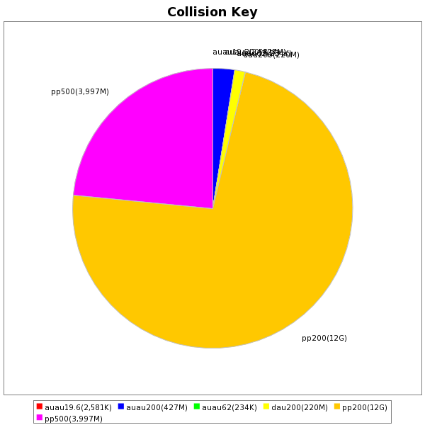
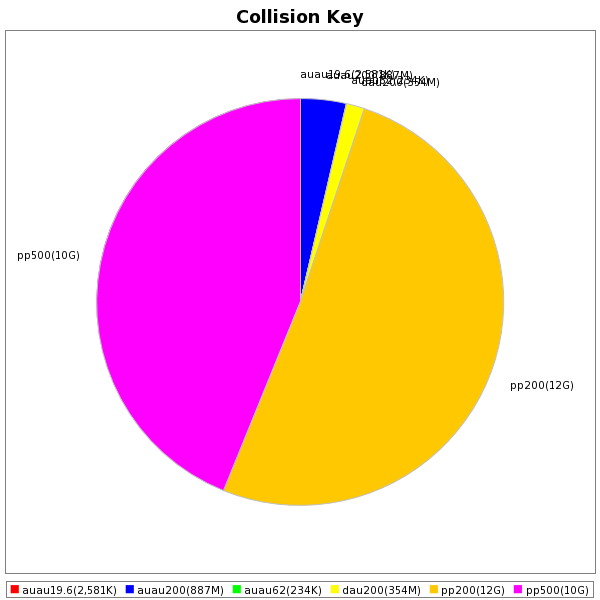
Popular datasets snapshot, August 2013
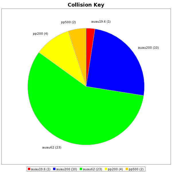
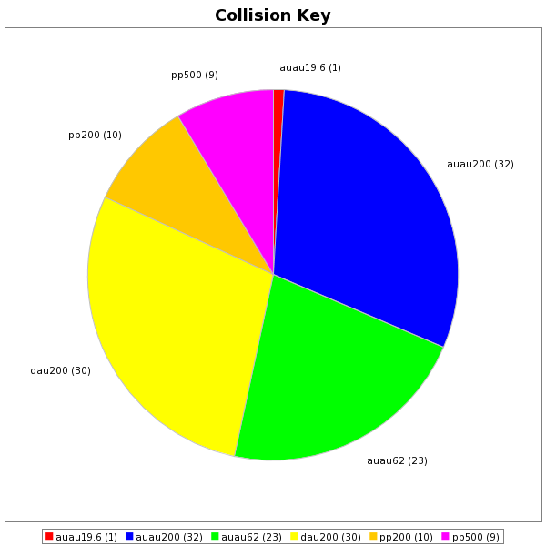
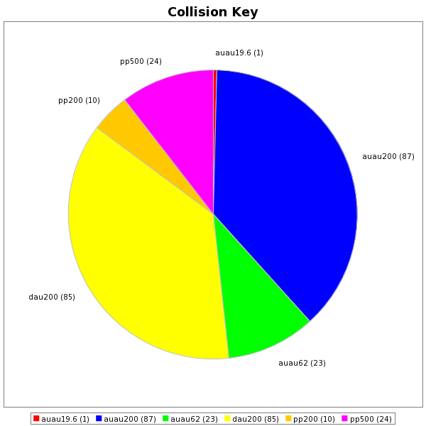
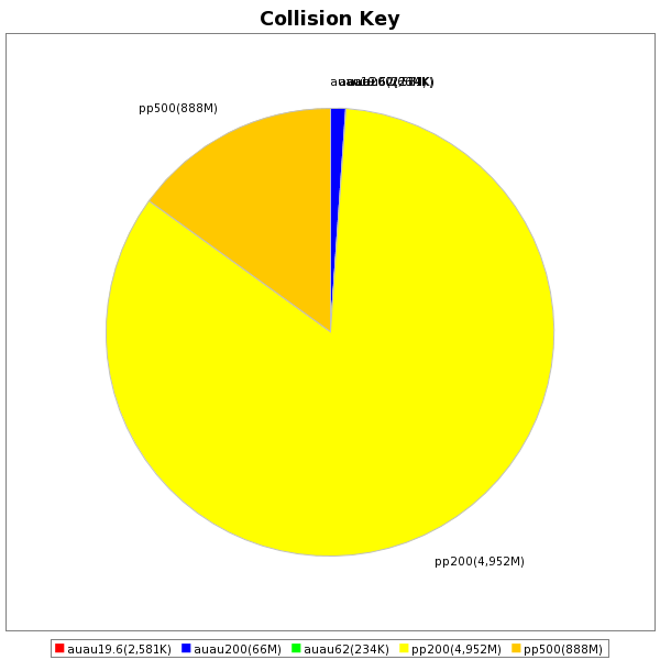
Here is a quick view of our user's really access from our datasets - the top row is by request and the bottom is renormalized by the number of events estimated as part of the request (if a dataset A is requested 10 times more than dataset B but dataset B has 10 times more event, the pie chart slices will be equal on the bottom graph but shows A 10 times bigger).
| Past month | Past 3 months | Past 6 months |
 |
 |
 |
 |
 |
 |
Groups:
- jeromel's blog
- Login or register to post comments
