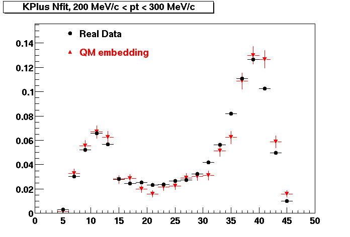
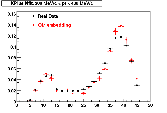
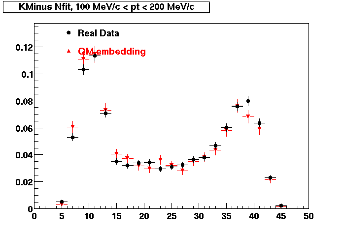
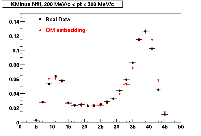
Quality Control
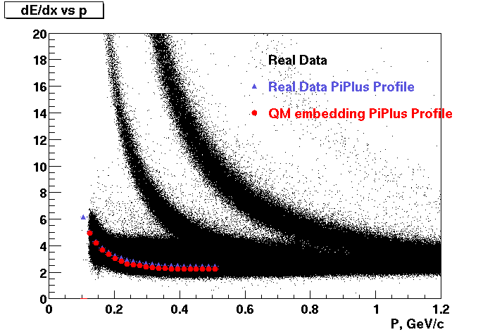
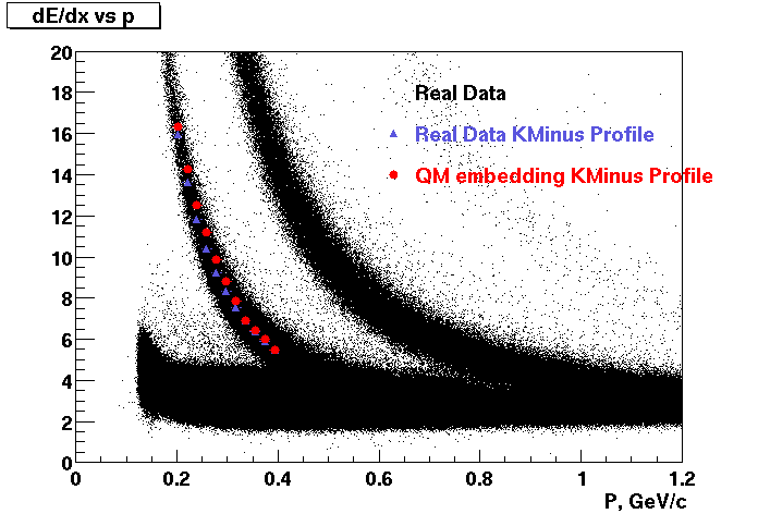
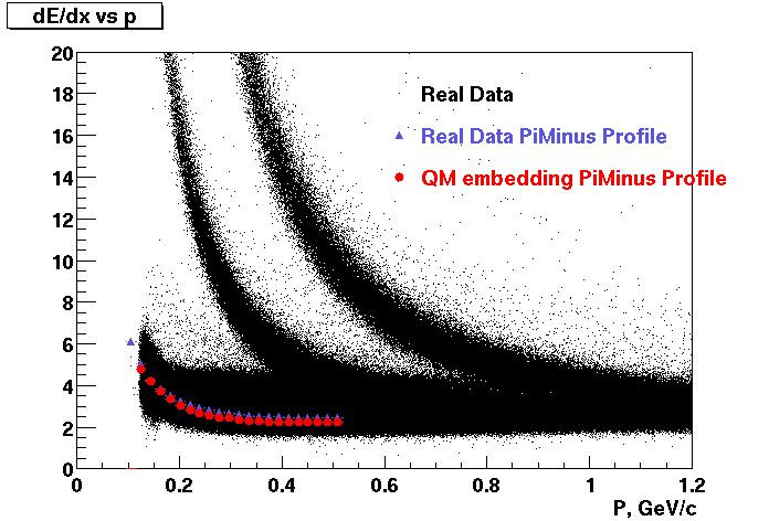
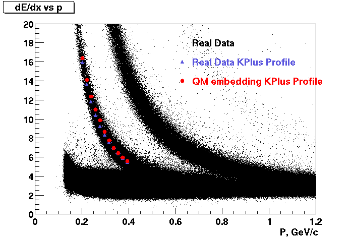
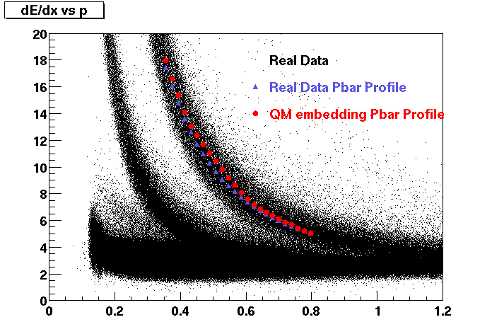
These are dedx vs P graphs. All of them show reasonable agreement with data.(Done on May 2002)
| Pi Minus | K Minus | Proton |
| Pi Plus | K Plus | P Bar |
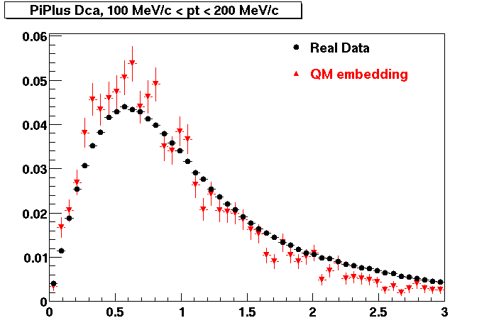
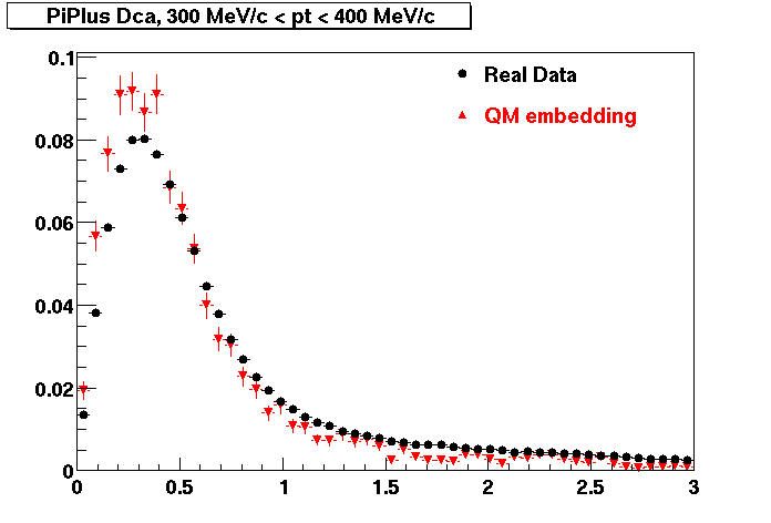
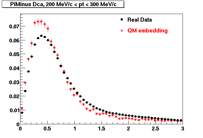
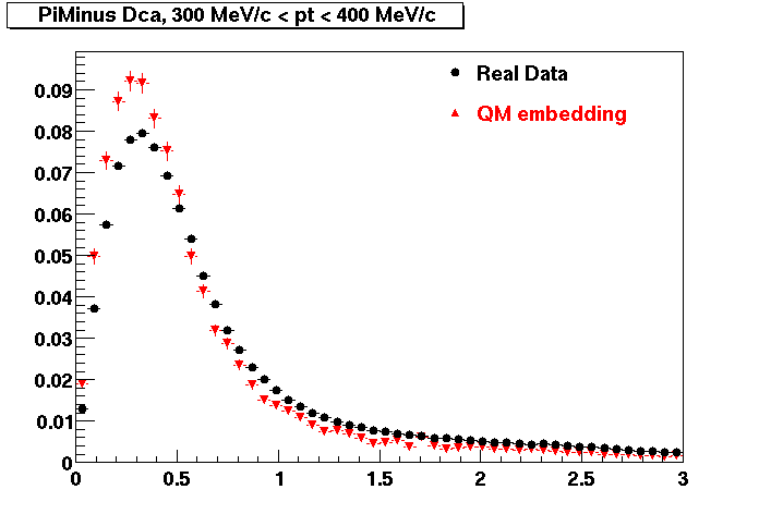
PI PLUS. In the following dca distributions some discrepancy is shown. Due to secondaries?
| Peripheral 0.1 GeV/c < pT < 0.2 Gev/c | MinBias 0.2 GeV/c < pT < 0.3 Gev/c | Central 0.3 GeV/c <pT < 0.4 GeV/c |
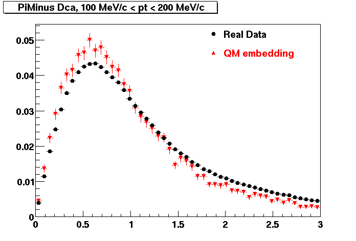
PI MINUS. Some discrepancy is shown. Due to secondaries?
| Peripheral 0.1 GeV/c < pT < 0.2 Gev/c | MinBias 0.2 GeV/c < pT < 0.3 Gev/c | Central 0.3 GeV/c <pT < 0.4 GeV/c |
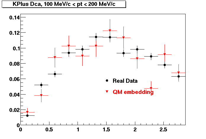
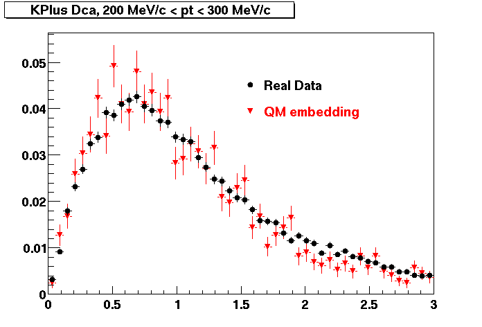
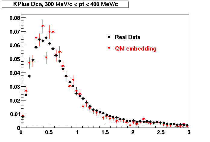
K PLUS. In the following dca distributions Good agreement with data is shown.
| Peripheral 0.1 GeV/c < pT < 0.2 Gev/c | MinBias 0.2 GeV/c < pT < 0.3 Gev/c | Central 0.3 GeV/c <pT < 0.4 GeV/c |
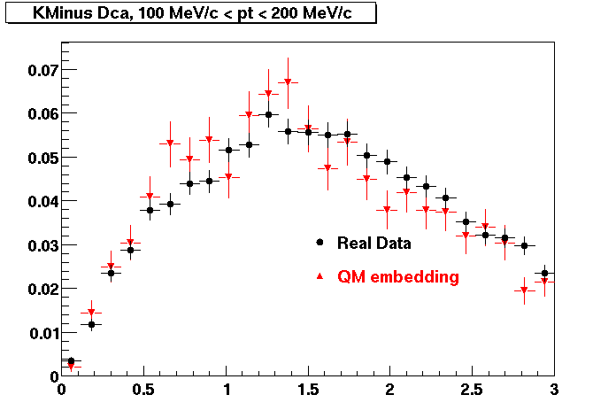
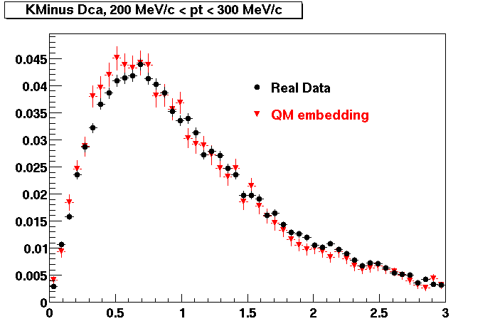
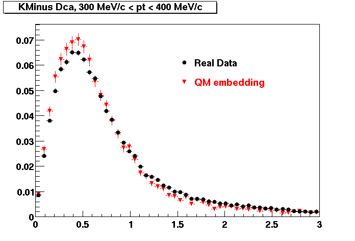
K MINUS. In the following dca distributions Good agreement with data is shown.
| Peripheral 0.1 GeV/c < pT < 0.2 Gev/c | MinBias 0.2 GeV/c < pT < 0.3 Gev/c | Central 0.3 GeV/c <pT < 0.4 GeV/c |
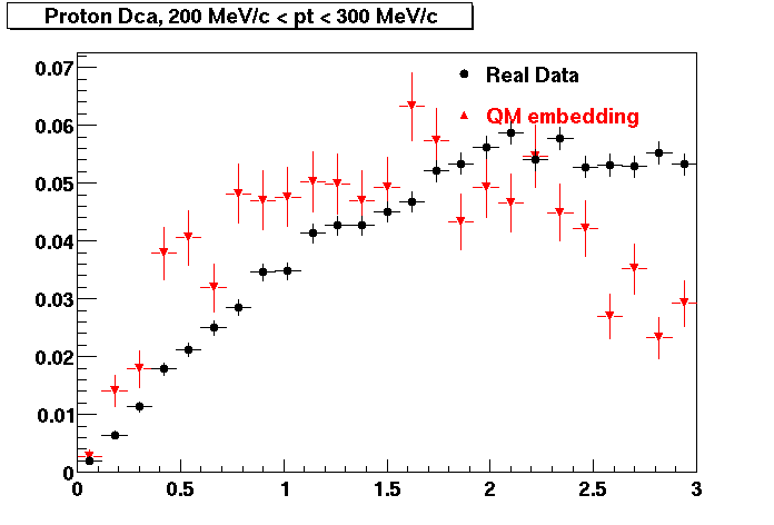
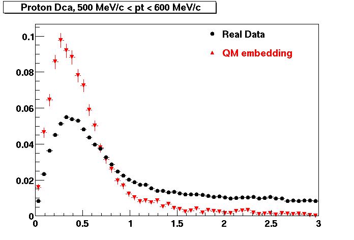
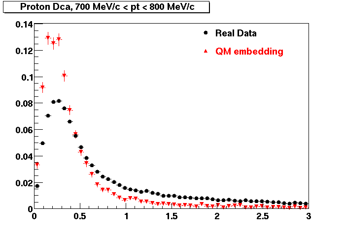
PROTON. The real data Dca distribution is wider, especially at low pT -> Most likely due to secondary tracks in the sample. A tail from background protons dominating distribution at low pt can be clearly seen. Expected deviation from the primary MC tracks.
| Peripheral 0.2 GeV/c < pT < 0.3 Gev/c | MinBias 0.5 GeV/c < pT < 0.6 Gev/c | Central 0.7 GeV/c <pT < 0.8 GeV/c |
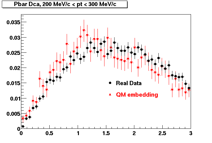
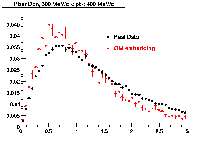
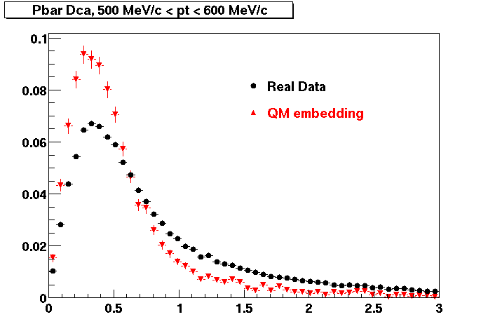
Pbar. The real data Dca distribution is wider, especially at low pT -> Most likely due to secondary tracks in the sample.
| Peripheral 0.2 GeV/c < pT < 0.3 Gev/c | MinBias 0.3 eV/c < pT < 0.4 Gev/c | Central 0.5 GeV/c <pT < 0.6 GeV/c |
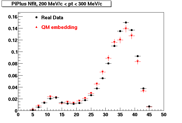
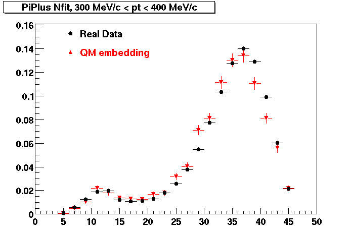
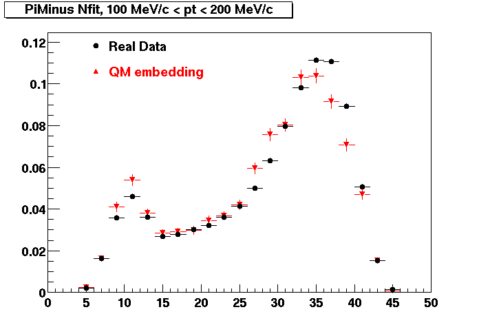
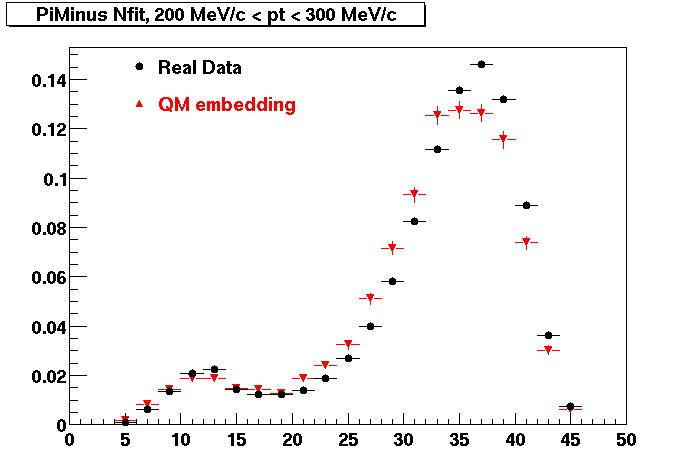
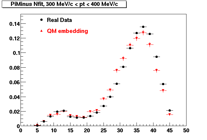
PI PLUS. Good agreement with data is shown.
| Peripheral 0.1 GeV/c < pT < 0.2 Gev/c | MinBias 0.2 GeV/c < pT < 0.3 Gev/c | Central 0.3 GeV/c <pT < 0.4 GeV/c |
PI MINUS. Good agreement with data is shown.
| Peripheral 0.1 GeV/c < pT < 0.2 Gev/c | Peripheral 0.2 GeV/c < pT < 0.3 Gev/c | Peripheral 0.3 GeV/c < pT < 0.4 Gev/c |
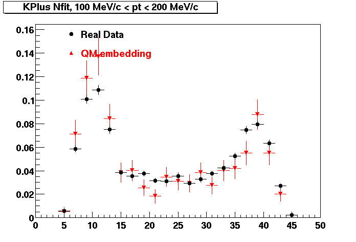
K PLUS. Good agreement with data is shown.
| Peripheral 0.1 GeV/c < pT < 0.2 Gev/c | MinBias 0.2 GeV/c < pT < 0.3 Gev/c | Central 0.3 GeV/c <pT < 0.4 GeV/c |
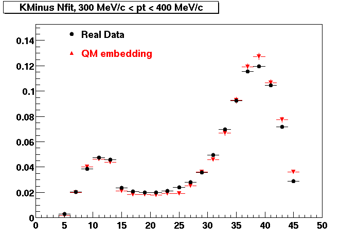
K MINUS. Good agreement with data is shown.
| Peripheral 0.1 GeV/c < pT < 0.2 Gev/c | Peripheral 0.2 GeV/c < pT < 0.3 Gev/c | Peripheral 0.3 GeV/c < pT < 0.4 Gev/c |
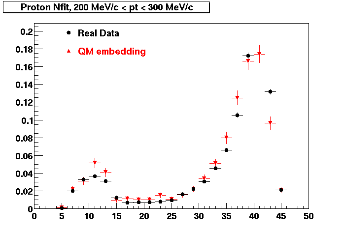
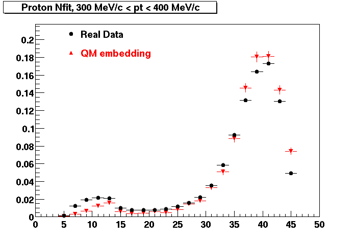
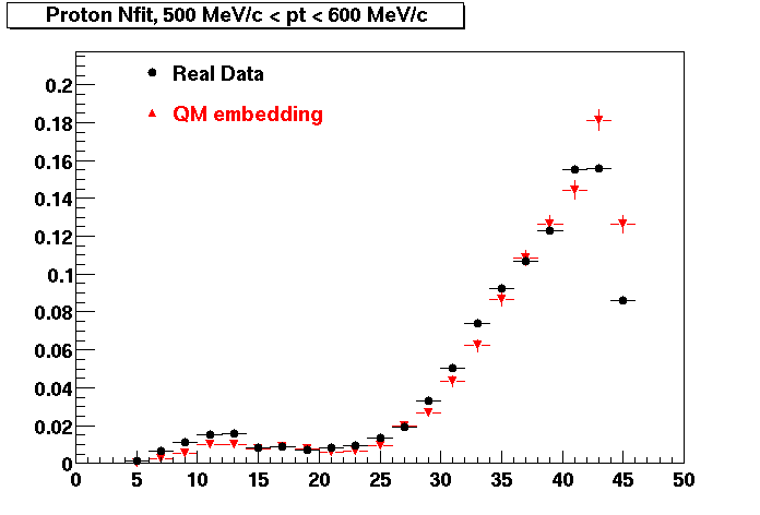
PROTON. Good agreement with data is shown.
| Peripheral 0.2 GeV/c < pT < 0.3 Gev/c | Peripheral 0.3 GeV/c < pT < 0.4 Gev/c | Peripheral 0.5 GeV/c < pT < 0.6 Gev/c |
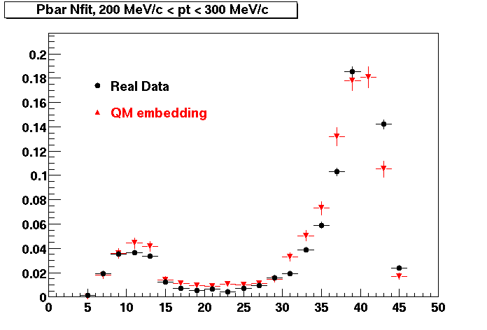
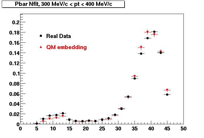
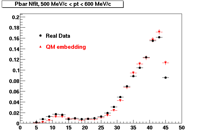
Pbar. Good agreement with data is shown.
| Peripheral 0.2 GeV/c < pT < 0.3 Gev/c | Peripheral 0.3 GeV/c < pT < 0.4 Gev/c | Peripheral 0.5 GeV/c < pT < 0.6 Gev/c |
